

What’s In A Name? Featuring the Fountain Pen Revolution Quickdraw

Naming things is a ton of fun, and I don’t just mean like “Namey McNameface”. I take great pride in the naming of my posts and projects and even (especially) my children. I’ve also been very honored over the years as others have taken my name suggestions from time to time, such as the Write Notepads ”Writer’s Bloc“ loyalty program (that’s a referral link that gives me points, and gives a discount to first time buyers, full disclosure), a handful of episodes of the Pen Addict podcast, and now the Quickdraw fountain pen from Fountain Pen Revolution.
I’ve been aware of FPR for a little while, but I hadn’t tried any of their pens previously. They are a family-owned company out of Texas that contracts with Indian manufacturers to make pens to their specifications, as well as retailing a few other brands. In February of this year FPR posted a picture of a new pen with a magnetic cap to their social media platforms asking for naming suggestions, offering a free pen to whomever suggested a name that they chose. I’ll admit, I didn’t even see the offer of a free pen, I just saw a picture of a pen and the question “what should we name it”, and jumped in with my suggestion “QuickDraw.”
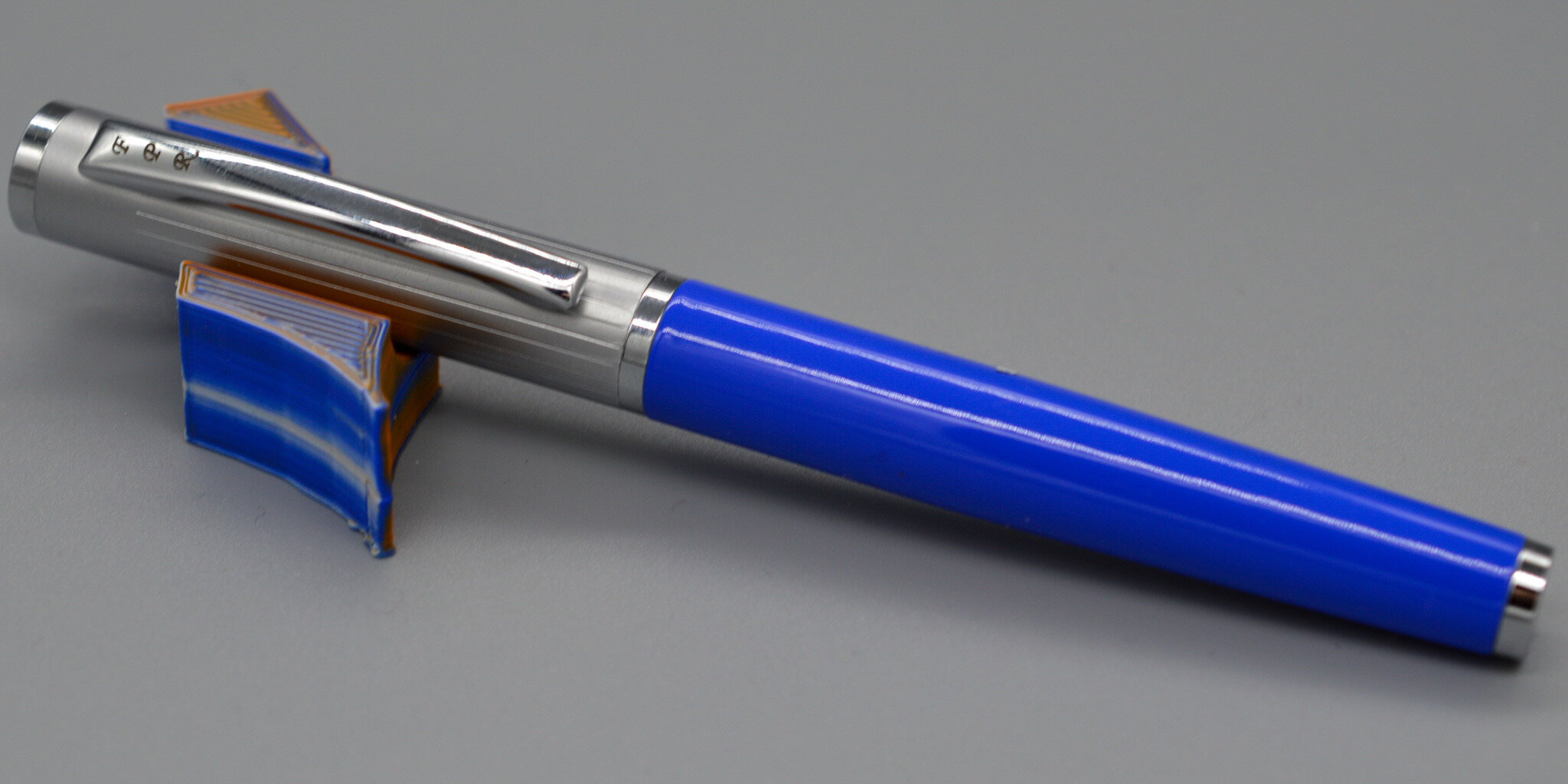


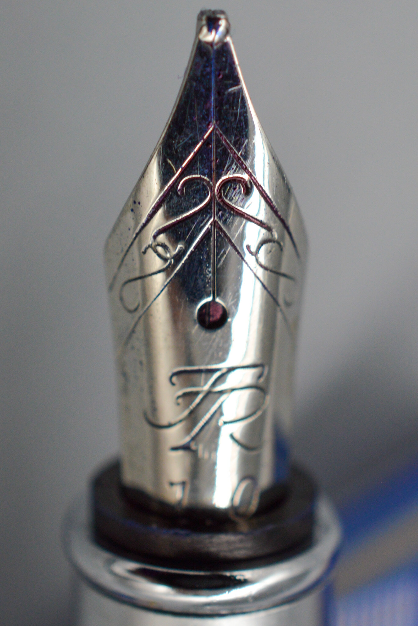
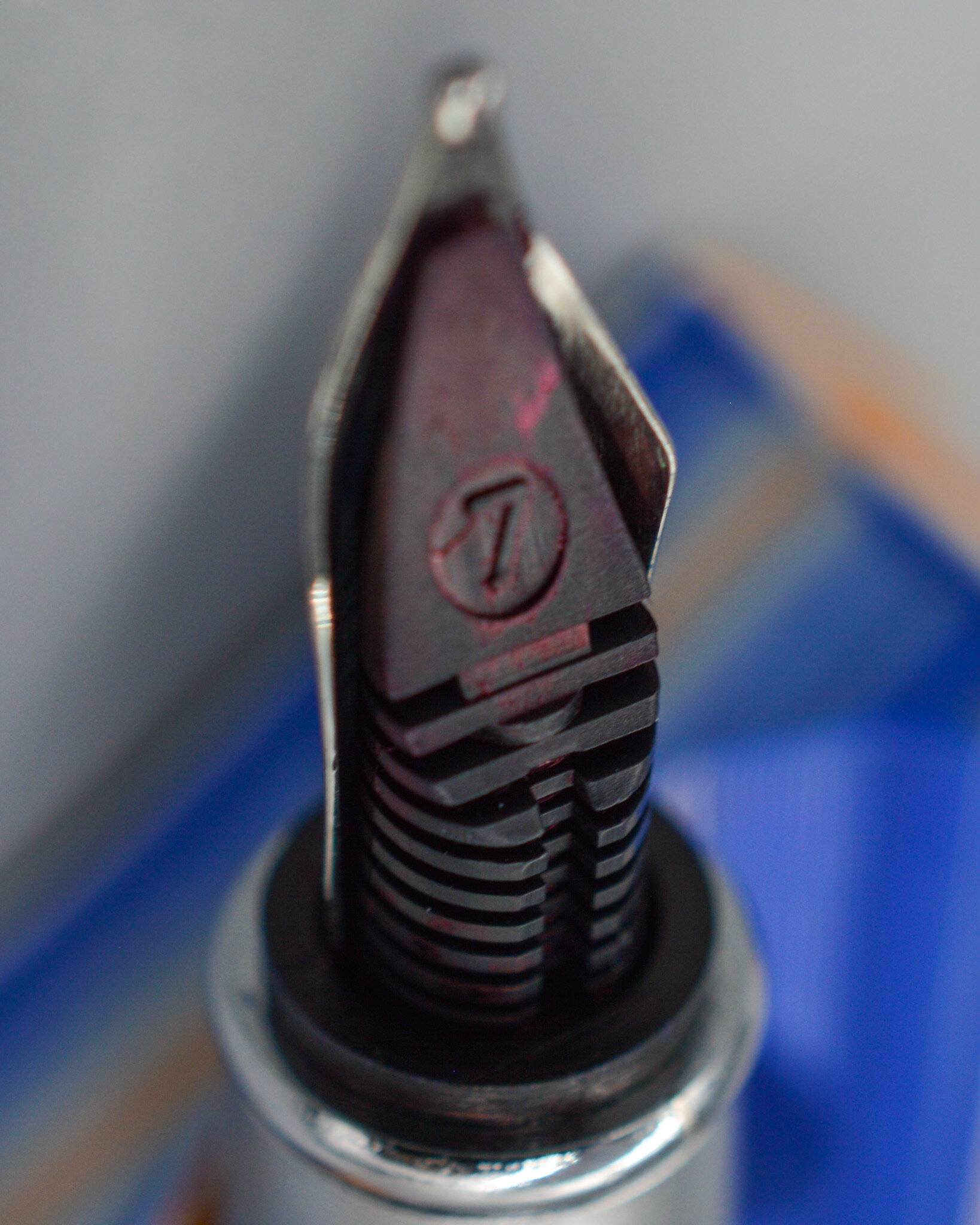
Of course, the idea behind the name was simple. Magnetic caps are quick, and pens are used to draw. QuickDraw! FPR simplified the capitalization to Quickdraw, which is probably for the best, but they also sent me a message offering me the pen in any color and nib that I liked. The pen comes in blue, orange, and black, and I decided that I hadn’t gotten a new blue pen in a little while, so I went with that color. When it came to the nib, however, I was faced with a bigger decision. One of the things that FPR is known for is their modern steel flex nibs, which also feature ebonite feeds. I came very close to choosing a Quickdraw Flex model, but in the end I was more intrigued by the non-flex stub model, which is a rare tipped steel stub.
There’s no particular reason I’ve ever been able to discern why most steel factory stubs are left untipped, but it’s pretty consistent across different price points and different brands and different continents. A Nemosine 0.6 nib and a Franklin Christoph 1.9 Music nib, and a Kaweco 2.3 calligraphy nib, and a Pilot Plumix medium stub, etc., check any one of them, and you’ll see that the writing point is all steel; there is no tipping. I’ve had tipped steel nibs that have been ground into italics and stubs before, but I had never seen a factory stub with tipping, so I thought it would be worth giving a try.
I’m not sure who makes this nib for FPR, but I like the FPR logo and scroll work on it. I also like the FPR initials on the clip of the pen and the subtle line markings along the sides of the cap. Combined with the mix of polished and satin finishes on the cap and other metal trim, I think it gives the pen a very nice feeling of intentional design.

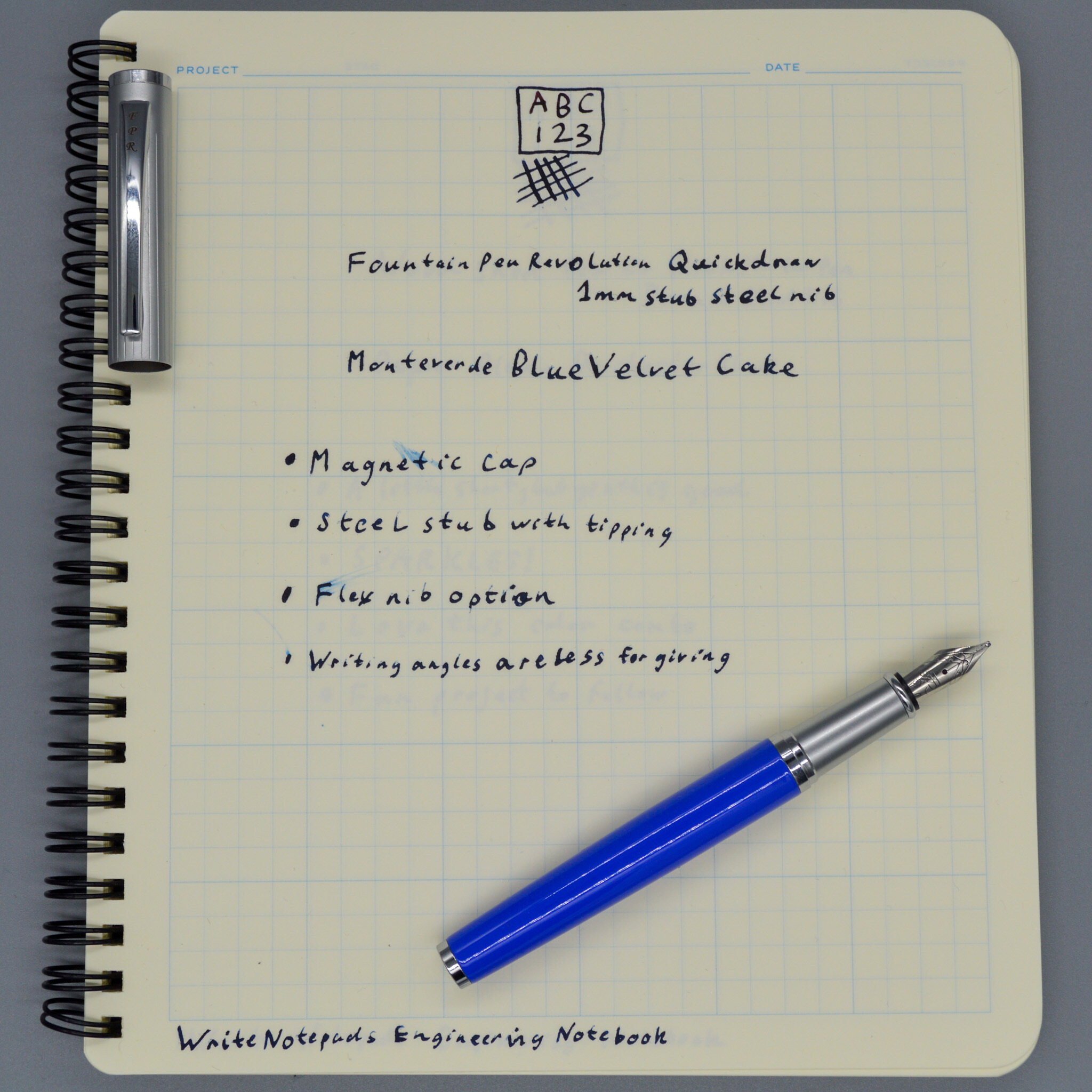
The Quickdraw isn’t a tiny pen, but it feels small compared to some of the other pens I’ve been reviewing recently. FPR has all of the specs written up on their blog post announcing the pen if you’re inclined to check the numbers. What I decided to do instead was to photograph it alongside another recent magnet capping pen, the Monteverde Ritma. The Quickdraw is for sure the smaller of the two, but not by as much as I expected. The grip section of the Quickdraw is actually significantly longer than that of the Ritma, albeit also more narrow. The Quickdraw holds a smaller nib (FPR calls it a #5.5 nib), whereas the Ritma holds a larger #6 nib, which accounts for the proportional differences of the two pens. Both pens post securely, although the Quickdraw does not use magnets to post like the Ritma, relying instead on a traditional friction posting.


I have to admit that I did not know what I was doing when I made my nib choice for this pen. I made an assumption that because the FPR stub nib was tipped, it would be inherently more forgiving of different writing angles. I had no reason to make that assumption, it was just my own inherent bias, and it did not bear out. What I found instead was a surprisingly crisp 1mm stub that had a definite sweet spot, but when you hit that spot it gives you some beautiful line variation. I probably would not enjoy this nib every day, personally, but I have also sold off cursive italic nibs ground by master nibmeisters because they were just “too crisp” for my hand. It’s all about personal preference, and I think that someone who likes more of an italic nib would like the feel of this one.
At an MSRP of $29, this is one of the least expensive options out there for a magnetic capping pen. With its smaller nib and thinner section it is also worth considering for people with smaller hands or who prefer smaller pens. It is not a light pen, though, as it is made from lacquered metal, so be aware that it will have some heft even if you do not post it. Ultimately, I’m happy to have been able to assist FPR in naming this pen, and I’m happy to share this model with those of you who have been looking for an affordable magnetic capping pen on the smaller side of the size spectrum.
This pen was provided by Fountain Pen Revolution as a reward for naming the pen model, with knowledge that it would be used as a review unit.